Show Code
install.packages("ggplot2")
install.packages("dplyr")
install.packages("tidyr")
install.packages("stringr")
install.packages("tibble")
install.packages("viridis")
install.packages("patchwork")
install.packages("plotly")ggplot2 is a powerful and flexible visualization library in R based on the Grammar of Graphics
Grammar of Graphics: build complex plots by layering components such as data, aesthetics, geometries, scales, facets, and themes
Tutorial Outline:
patchworkplotlyNote: This tutorial will be written in R. If you would like to use ggplot2 in Python, (most of) the same commands are available as part of the plotnine package. Simply import plotnine and use the same syntax as ggplot2!
Install packages: (only need to do once)
install.packages("ggplot2")
install.packages("dplyr")
install.packages("tidyr")
install.packages("stringr")
install.packages("tibble")
install.packages("viridis")
install.packages("patchwork")
install.packages("plotly")After installing, you can load these packages into our environment:
library(ggplot2)
library(dplyr)
library(tidyr)
library(stringr)
library(tibble)
library(viridis)
library(patchwork)
library(plotly)In this tutorial, we will be working with data from college football games over the last 20 years (2005-2025), which can be found on Canvas (cfb_data.csv).
DATA_PATH <- "data"
cfb_data <- read.csv(file.path(DATA_PATH, "cfb_data.csv"))
str(cfb_data)#> 'data.frame': 30938 obs. of 27 variables:
#> $ Season : int 2005 2005 2005 2005 2005 2005 2005 2005 2005 2005 ...
#> $ Week : int 1 1 1 1 1 1 1 1 1 1 ...
#> $ SeasonType : chr "regular" "regular" "regular" "regular" ...
#> $ Completed : logi TRUE TRUE TRUE TRUE TRUE TRUE ...
#> $ ConferenceGame : logi FALSE FALSE FALSE FALSE FALSE FALSE ...
#> $ Attendance : int 0 0 0 0 0 0 0 0 0 0 ...
#> $ Venue : chr "" "Nippert Stadium" "Allegacy Federal Credit Union Stadium" "Williams-Brice Stadium" ...
#> $ TeamId : int 248 2132 154 2579 41 265 9 202 2117 254 ...
#> $ Team : chr "Houston" "Cincinnati" "Wake Forest" "South Carolina" ...
#> $ Classification : chr "fbs" "fbs" "fbs" "fbs" ...
#> $ Conference : chr "Conference USA" "Big East" "ACC" "SEC" ...
#> $ Points : int 24 28 20 24 38 38 63 10 13 27 ...
#> $ Q1 : int 21 14 3 14 3 17 14 0 0 0 ...
#> $ Q2 : int 0 0 3 3 28 0 14 3 3 10 ...
#> $ Q3 : int 0 7 7 7 0 14 14 0 3 17 ...
#> $ Q4 : int 3 7 7 0 7 7 21 7 7 0 ...
#> $ OppTeamId : int 2483 2199 238 2116 2084 70 218 135 84 12 ...
#> $ OppTeam : chr "Oregon" "Eastern Michigan" "Vanderbilt" "UCF" ...
#> $ OppClassification: chr "fbs" "fbs" "fbs" "fbs" ...
#> $ OppConference : chr "Pac-10" "Mid-American" "SEC" "Conference USA" ...
#> $ OppPoints : int 38 26 24 15 0 26 16 41 20 24 ...
#> $ OppQ1 : int 14 10 3 3 0 6 0 17 0 0 ...
#> $ OppQ2 : int 3 10 7 0 0 6 2 7 14 3 ...
#> $ OppQ3 : int 14 0 7 10 0 7 7 3 0 14 ...
#> $ OppQ4 : int 7 6 7 2 0 7 7 14 6 7 ...
#> $ Where : chr "Home" "Home" "Home" "Home" ...
#> $ Outcome : chr "Loss" "Win" "Loss" "Win" ...This is a pretty big dataset!
For the sake of this tutorial, let’s subset this dataset to focus on a handful of teams, e.g., Notre Dame and Arkansas.
keep_teams <- c("Notre Dame", "Arkansas")
cfb_subset <- cfb_data[cfb_data$Team %in% keep_teams, ]
str(cfb_subset)#> 'data.frame': 510 obs. of 27 variables:
#> $ Season : int 2005 2005 2005 2005 2005 2005 2005 2005 2005 2005 ...
#> $ Week : int 2 3 6 7 7 8 10 10 11 12 ...
#> $ SeasonType : chr "regular" "regular" "regular" "regular" ...
#> $ Completed : logi TRUE TRUE TRUE TRUE TRUE TRUE ...
#> $ ConferenceGame : logi TRUE FALSE FALSE FALSE TRUE FALSE ...
#> $ Attendance : int 0 0 0 0 0 0 0 0 0 0 ...
#> $ Venue : chr "Razorback Stadium" "Notre Dame Stadium" "" "Notre Dame Stadium" ...
#> $ TeamId : int 8 87 8 87 8 87 8 87 87 8 ...
#> $ Team : chr "Arkansas" "Notre Dame" "Arkansas" "Notre Dame" ...
#> $ Classification : chr "fbs" "fbs" "fbs" "fbs" ...
#> $ Conference : chr "SEC" "FBS Independents" "SEC" "FBS Independents" ...
#> $ Points : int 24 41 44 31 17 49 10 41 42 44 ...
#> $ Q1 : int 7 NA 10 7 3 7 0 14 7 14 ...
#> $ Q2 : int 3 NA 13 14 7 14 10 7 21 27 ...
#> $ Q3 : int 14 NA 21 0 0 21 0 0 7 0 ...
#> $ Q4 : int 0 NA 0 10 7 7 0 20 7 3 ...
#> $ OppTeamId : int 238 127 2433 30 2 252 2579 2633 2426 344 ...
#> $ OppTeam : chr "Vanderbilt" "Michigan State" "UL Monroe" "USC" ...
#> $ OppClassification: chr "fbs" "fbs" "fbs" "fbs" ...
#> $ OppConference : chr "SEC" "Big Ten" "Sun Belt" "Pac-10" ...
#> $ OppPoints : int 28 44 15 34 34 23 14 21 21 10 ...
#> $ OppQ1 : int 0 NA 2 14 0 10 7 3 7 0 ...
#> $ OppQ2 : int 10 NA 6 0 6 0 0 7 0 3 ...
#> $ OppQ3 : int 3 NA 0 7 14 13 7 11 7 7 ...
#> $ OppQ4 : int 15 NA 7 13 14 0 0 0 7 0 ...
#> $ Where : chr "Home" "Home" "Home" "Home" ...
#> $ Outcome : chr "Loss" "Loss" "Win" "Loss" ...Please feel free to choose (or add) other teams if you prefer! Below is a list of the teams available in the dataset:
sort(unique(cfb_data$Team))#> [1] "Air Force" "Akron" "Alabama"
#> [4] "App State" "Arizona" "Arizona State"
#> [7] "Arkansas" "Arkansas State" "Army"
#> [10] "Auburn" "Ball State" "Baylor"
#> [13] "Boise State" "Boston College" "Bowling Green"
#> [16] "Buffalo" "BYU" "California"
#> [19] "Central Michigan" "Charlotte" "Cincinnati"
#> [22] "Clemson" "Coastal Carolina" "Colorado"
#> [25] "Colorado State" "Delaware" "Duke"
#> [28] "East Carolina" "Eastern Michigan" "Florida"
#> [31] "Florida Atlantic" "Florida International" "Florida State"
#> [34] "Fresno State" "Georgia" "Georgia Southern"
#> [37] "Georgia State" "Georgia Tech" "Hawai'i"
#> [40] "Houston" "Idaho" "Illinois"
#> [43] "Indiana" "Iowa" "Iowa State"
#> [46] "Jacksonville State" "James Madison" "Kansas"
#> [49] "Kansas State" "Kennesaw State" "Kent State"
#> [52] "Kentucky" "Liberty" "Louisiana"
#> [55] "Louisiana Tech" "Louisville" "LSU"
#> [58] "Marshall" "Maryland" "Massachusetts"
#> [61] "Memphis" "Miami" "Miami (OH)"
#> [64] "Michigan" "Michigan State" "Middle Tennessee"
#> [67] "Minnesota" "Mississippi State" "Missouri"
#> [70] "Missouri State" "Navy" "NC State"
#> [73] "Nebraska" "Nevada" "New Mexico"
#> [76] "New Mexico State" "North Carolina" "North Texas"
#> [79] "Northern Illinois" "Northwestern" "Notre Dame"
#> [82] "Ohio" "Ohio State" "Oklahoma"
#> [85] "Oklahoma State" "Old Dominion" "Ole Miss"
#> [88] "Oregon" "Oregon State" "Penn State"
#> [91] "Pittsburgh" "Purdue" "Rice"
#> [94] "Rutgers" "Sam Houston" "San Diego State"
#> [97] "San José State" "SMU" "South Alabama"
#> [100] "South Carolina" "South Florida" "Southern Miss"
#> [103] "Stanford" "Syracuse" "TCU"
#> [106] "Temple" "Tennessee" "Texas"
#> [109] "Texas A&M" "Texas State" "Texas Tech"
#> [112] "Toledo" "Troy" "Tulane"
#> [115] "Tulsa" "UAB" "UCF"
#> [118] "UCLA" "UConn" "UL Monroe"
#> [121] "UNLV" "USC" "Utah"
#> [124] "Utah State" "UTEP" "UTSA"
#> [127] "Vanderbilt" "Virginia" "Virginia Tech"
#> [130] "Wake Forest" "Washington" "Washington State"
#> [133] "West Virginia" "Western Kentucky" "Western Michigan"
#> [136] "Wisconsin" "Wyoming"Let’s also create a summary dataset with the average points scored and allowed per quarter for each team in each season, as well as the average points differential and win percentage.
This summarized dataset will be useful for some of our visualizations later on.
cfb_summary <- cfb_subset |>
# group data by Season and Team
group_by(Season, Team) |>
summarise( # for each (Season, Team),
# compute mean for each specified column (Points, Q1, ...)
across(
c(Points, Q1, Q2, Q3, Q4, OppPoints, OppQ1, OppQ2, OppQ3, OppQ4),
~ mean(.x, na.rm = TRUE),
.names = "Avg{col}"
),
# compute average points differential (team's point - opponent's points)
PointsDifferential = mean(Points - OppPoints, na.rm = TRUE),
# compute win percentage
WinPercent = mean(Outcome == "Win", na.rm = TRUE)
)
cfb_summary#> # A tibble: 42 × 14
#> # Groups: Season [21]
#> Season Team AvgPoints AvgQ1 AvgQ2 AvgQ3 AvgQ4 AvgOppPoints AvgOppQ1 AvgOppQ2
#> <int> <chr> <dbl> <dbl> <dbl> <dbl> <dbl> <dbl> <dbl> <dbl>
#> 1 2005 Arka… 23.4 4.1 8.3 5.3 5.7 25.4 5.1 7.5
#> 2 2005 Notr… 36.7 7.27 12.3 6.45 10.3 24.5 5.55 3.36
#> 3 2006 Arka… 26.2 6.58 9.58 5.42 4.83 19.2 3.92 6.42
#> 4 2006 Notr… 31 7.08 10.8 6.85 6.23 23.8 7.31 6.62
#> 5 2007 Arka… 37.6 8 10.6 6.91 10.9 27.5 5.27 5.91
#> 6 2007 Notr… 16.4 2.18 3.45 4.55 3.73 28.8 7.27 8
#> 7 2008 Arka… 21.4 5 4.55 4.73 7.09 31.8 6.82 10.7
#> 8 2008 Notr… 24.7 5.5 7.42 7.5 3.58 22.2 2.75 7.42
#> 9 2009 Arka… 35 7.6 12 10.9 6.5 26.3 4.4 5.7
#> 10 2009 Notr… 30.1 5.9 9.9 4.1 9.5 25.9 5.3 6.1
#> # ℹ 32 more rows
#> # ℹ 4 more variables: AvgOppQ3 <dbl>, AvgOppQ4 <dbl>, PointsDifferential <dbl>,
#> # WinPercent <dbl>Here’s a quick look at our two main datasets:
as_tibble(cfb_subset)#> # A tibble: 510 × 27
#> Season Week SeasonType Completed ConferenceGame Attendance Venue TeamId
#> <int> <int> <chr> <lgl> <lgl> <int> <chr> <int>
#> 1 2005 2 regular TRUE TRUE 0 "Razorbac… 8
#> 2 2005 3 regular TRUE FALSE 0 "Notre Da… 87
#> 3 2005 6 regular TRUE FALSE 0 "" 8
#> 4 2005 7 regular TRUE FALSE 0 "Notre Da… 87
#> 5 2005 7 regular TRUE TRUE 0 "Razorbac… 8
#> 6 2005 8 regular TRUE FALSE 0 "Notre Da… 87
#> 7 2005 10 regular TRUE TRUE 0 "Razorbac… 8
#> 8 2005 10 regular TRUE FALSE 0 "Notre Da… 87
#> 9 2005 11 regular TRUE FALSE 0 "Notre Da… 87
#> 10 2005 12 regular TRUE TRUE 0 "" 8
#> # ℹ 500 more rows
#> # ℹ 19 more variables: Team <chr>, Classification <chr>, Conference <chr>,
#> # Points <int>, Q1 <int>, Q2 <int>, Q3 <int>, Q4 <int>, OppTeamId <int>,
#> # OppTeam <chr>, OppClassification <chr>, OppConference <chr>,
#> # OppPoints <int>, OppQ1 <int>, OppQ2 <int>, OppQ3 <int>, OppQ4 <int>,
#> # Where <chr>, Outcome <chr>as_tibble(cfb_summary)#> # A tibble: 42 × 14
#> Season Team AvgPoints AvgQ1 AvgQ2 AvgQ3 AvgQ4 AvgOppPoints AvgOppQ1 AvgOppQ2
#> <int> <chr> <dbl> <dbl> <dbl> <dbl> <dbl> <dbl> <dbl> <dbl>
#> 1 2005 Arka… 23.4 4.1 8.3 5.3 5.7 25.4 5.1 7.5
#> 2 2005 Notr… 36.7 7.27 12.3 6.45 10.3 24.5 5.55 3.36
#> 3 2006 Arka… 26.2 6.58 9.58 5.42 4.83 19.2 3.92 6.42
#> 4 2006 Notr… 31 7.08 10.8 6.85 6.23 23.8 7.31 6.62
#> 5 2007 Arka… 37.6 8 10.6 6.91 10.9 27.5 5.27 5.91
#> 6 2007 Notr… 16.4 2.18 3.45 4.55 3.73 28.8 7.27 8
#> 7 2008 Arka… 21.4 5 4.55 4.73 7.09 31.8 6.82 10.7
#> 8 2008 Notr… 24.7 5.5 7.42 7.5 3.58 22.2 2.75 7.42
#> 9 2009 Arka… 35 7.6 12 10.9 6.5 26.3 4.4 5.7
#> 10 2009 Notr… 30.1 5.9 9.9 4.1 9.5 25.9 5.3 6.1
#> # ℹ 32 more rows
#> # ℹ 4 more variables: AvgOppQ3 <dbl>, AvgOppQ4 <dbl>, PointsDifferential <dbl>,
#> # WinPercent <dbl>The basic structure of a ggplot consists of three main components:
Data: The dataset you want to visualize.
Aesthetics: Mappings that describe how data variables are mapped to visual properties (e.g., x and y axes, color, size). Common aesthetics include:
x, ycolor (outline color)fill (interior color for bars/boxes)shapesizealpha (transparency)linetype (for lines)Geometries: The type of plot you want to create (e.g., points, lines, bars). Common geometries include:
geom_point() for scatter plotsgeom_line() for line plotsgeom_bar() for bar plotsgeom_histogram() for histogramsgeom_density() for density plotsgeom_boxplot() for boxplotsgeom_ribbon() for ribbons/areasgeom_errorbar() for error barsgeom_hline() for horizontal linesgeom_vline() for vertical linesgeom_abline() for arbitrary linesThe general syntax is:
ggplot(data) +
geom_*(
aes(x = ..., y = ...), # aesthetics (usually column names from data.frame)
<OTHER_ARGUMENTS> # other arguments
)To create a histogram of the points scored by our selected teams across all games:
cfb_subsetgeom_histogramx = Points (i.e., which column from the dataset to plot on the x-axis)ggplot(data = cfb_subset) +
geom_histogram(
aes(x = Points)
)
Q: How would you modify the above code to create a histogram of the points scored by our selected teams only in the fourth quarter (Q4)?
ggplot(data = cfb_subset) +
geom_histogram(
aes(x = Q4)
)
We can also add additional arguments to customize the histogram, such as the number of bins, line color, fill color, etc.
ggplot(data = cfb_subset) +
geom_histogram(
aes(x = Points),
bins = 15,
fill = "lightblue", # fill = color of the inside/fill
color = "darkblue" # color = color of the line/border
)
Q: Try modifying the above code so that the outline color of the histogram is “grey93”?
ggplot(data = cfb_subset) +
geom_histogram(
aes(x = Points),
bins = 15,
fill = "lightblue", # fill = color of the inside/fill
color = "grey93" # color = color of the line/border
)
Instead of the histogram geometry, we can alternatively plot the data as a density plot (using geom_density()):
ggplot(cfb_subset) +
geom_density(
aes(x = Points)
)
And with additional customization:
ggplot(cfb_subset) +
geom_density(
aes(x = Points),
fill = "lightblue", # fill = color of the inside/fill
color = "darkblue" # color = color of the line/border
)
However, this overall distribution is not very informative since we probably want to know the points distribution for each team separately.
To do this, we can map the Team variable to the color aesthetic:
ggplot(cfb_subset) +
geom_density(
aes(x = Points, color = Team)
)
And/or we can map the Team variable to the fill aesthetic:
ggplot(cfb_subset) +
geom_density(
aes(x = Points, fill = Team)
)
ggplot(cfb_subset) +
geom_density(
aes(x = Points, color = Team, fill = Team)
)
We should also add some transparency when using fill to avoid complete overlap (alpha = 0 is completely transparent; alpha = 1 is completely opaque)
ggplot(cfb_subset) +
geom_density(
aes(x = Points, fill = Team),
alpha = 0.4
)
ggplot(cfb_subset) +
geom_density(
aes(x = Points, color = Team, fill = Team),
alpha = 0.4
)
Q: Create a histogram of the fourth quarter points scored (Q4), where the fill aesthetic corresponds to Team. Set the transparency (alpha) of the fill to be 0.8, change the linewidth of the histogram outline to 0.5, and change the color of the outline to be black.
ggplot(cfb_subset) +
geom_histogram(
aes(x = Q4, fill = Team),
alpha = 0.4, linewidth = 0.5, color = "black"
)
Arguably, the most confusing part of ggplot is understanding the difference between setting global aesthetics versus mapping aesthetics to a variable.
Recall: we have already seen two different ways to specify the color (and fill) of our density plot, e.g.,
Setting the color globally: color is specified outside aes()
ggplot(cfb_subset) +
geom_density(
aes(x = Points),
color = "darkblue"
)
Mapping the color to a variable: color is specified inside aes()
ggplot(cfb_subset) +
geom_density(
aes(x = Points, color = Team)
)
In general, only use aes() for mapping aesthetics to data variables. Any fixed (global) aesthetic values (e.g., constant colors, sizes, transparencies) should be specified outside of aes().
Q: What happens if you put a fixed value (e.g., "darkblue") inside aes()?
ggplot(cfb_subset) +
geom_density(
aes(x = Points, color = "darkblue")
)
A: ggplot will treat it as a categorical variable and create a legend for it! Note that all lines will still be the same color and not the intended dark blue color.
One of the best features of ggplot2 is that we can easily create complex plots by adding (+) simple layers together.
Here’s a quick summary of the main types of layers we can add to a ggplot:
To demonstrate this, let’s first start by creating a basic scatter plot (geom_point()) of the average point differentials for each season and team:
ggplot(cfb_summary) +
geom_point(
aes(x = Season, y = PointsDifferential, color = Team)
)
We can then add a line layer (geom_line()) to connect the points for each team:
ggplot(cfb_summary) +
geom_point(
aes(x = Season, y = PointsDifferential, color = Team)
) +
geom_line(
aes(x = Season, y = PointsDifferential, color = Team)
)
It can be quite tedious to type out the aesthetics for each geom_*() layer. Luckily, if the aesthetics are the same across multiple layers, we can specify them in the initial ggplot() call; such aesthetics will then be inherited by all subsequent layers. The above code chunk is equivalent to:
ggplot(cfb_summary) +
aes(x = Season, y = PointsDifferential, color = Team) +
geom_point() +
geom_line()
Remember: we can customize each layer individually by adding additional arguments to each geom_*() function. For example, we can change the point size and line width:
ggplot(cfb_summary) +
aes(x = Season, y = PointsDifferential, color = Team) +
geom_point(size = 3) +
geom_line(linewidth = 1)
This is just the starting point. We can continue to add more and more layers to build up our plot. As one more example, let’s add one more layer to the plot: a horizontal dotted line at y = 0 to indicate when the average points differential is zero.
ggplot(cfb_summary) +
aes(x = Season, y = PointsDifferential, color = Team) +
geom_point(size = 3) +
geom_line(linewidth = 1) +
geom_hline(yintercept = 0, linetype = "dotted", color = "black")
Q: Before running the code chunk below, think to yourself what the following code would produce:
ggplot(cfb_summary) +
aes(x = Season, y = PointsDifferential) +
geom_point() +
geom_line(aes(color = Team))
A: Because the x and y aesthetics are specified outside of any geom_*(), they apply to all subsequent layers (i.e., geom_point() and geom_line()). However, the color aesthetic is only specified for the geom_line() layer. Therefore, the points will all be the same color (default color is black), while the lines will be colored by team.
Q: What is the difference between the above plot and the plot below?
ggplot(cfb_summary) +
aes(x = Season, y = PointsDifferential) +
geom_line(aes(color = Team)) +
geom_point()
A: The only difference is the order of the layers. In the first plot, the points are drawn first, followed by the lines; hence, the line appears on top of the points. In the second plot, the lines are drawn first, followed by the points; hence, the points appear on top of the lines.
We can even use different datasets and different aesthetics for different layers.
For example, let’s add a layer that shows the overall average points differential across all seasons for each team as horizontal dashed lines.
# compute overall average points differential for each team
overall_avg <- cfb_summary |>
group_by(Team) |>
summarise(OverallAvgDiff = mean(PointsDifferential))
# create ggplot with additional horizontal lines
ggplot(cfb_summary) +
aes(x = Season, y = PointsDifferential, color = Team) +
geom_point() +
geom_line() +
geom_hline(
data = overall_avg,
aes(yintercept = OverallAvgDiff, color = Team),
linetype = "dashed"
)
In general, each layer can have its own dataset and its own (mapped and/or set) aesthetics. If a layer does not specify its own dataset or aesthetics, it will inherit them from the initial ggplot(data) + aes(...) call.
Beyond adding geom_*() layers, we can also add other layers to customize our plots, such as adding titles and axis labels using labs():
ggplot(cfb_summary) +
aes(x = Season, y = PointsDifferential, color = Team) +
geom_point() +
geom_line() +
labs(
title = "Average Points Differential per Season",
x = "Year",
y = "Average Points Differential",
color = "Team Name"
)
As another example, consider the density plot from earlier. If we want to modify the legend title, we need to manually specify both the color and fill label in labs():
Wrong: Only labs(color = ...)
ggplot(cfb_subset) +
geom_density(
aes(x = Points, color = Team, fill = Team),
alpha = 0.4, linewidth = 1
) +
labs(
title = "Average Points Differential per Season",
x = "Year",
y = "Average Points Differential",
color = "Team Name"
)
Wrong: Only labs(fill = ...)
ggplot(cfb_subset) +
geom_density(
aes(x = Points, color = Team, fill = Team),
alpha = 0.4, linewidth = 1
) +
labs(
title = "Average Points Differential per Season",
x = "Year",
y = "Average Points Differential",
fill = "Team Name"
)
Correct: Both labs(color = ..., fill = ...)
ggplot(cfb_subset) +
geom_density(
aes(x = Points, color = Team, fill = Team),
alpha = 0.4, linewidth = 1
) +
labs(
title = "Average Points Differential per Season",
x = "Year",
y = "Average Points Differential",
color = "Team Name",
fill = "Team Name"
)
What does this demonstrate?
color, fill, size, etc.) has its own legend and corresponding label in labs()labs()Each aesthetic (e.g., color, size, shape) also has a scale, which can be customized.
For example, we can customize our (discrete) color scale using scale_color_manual() to specify our own colors for each team:
ggplot(cfb_summary) +
aes(x = Season, y = PointsDifferential, color = Team) +
geom_point() +
geom_line() +
scale_color_manual(
values = c("Notre Dame" = "#0C2340", "Arkansas" = "#9D2235")
)
If you are working with a continuous color scale, I would highly recommend checking out the viridis package, which provides colorblind-friendly color scales. In particular, you can use scale_color_viridis_c() for continuous color scales (and scale_color_viridis_d() for discrete color scales).
ggplot(cfb_summary) +
aes(x = Season, y = PointsDifferential, color = AvgPoints, linetype = Team) +
geom_line(color = "black") +
geom_point(size = 3) +
scale_color_viridis_c(option = "plasma")
In general, for any aesthetic (e.g., color, fill, size), there are corresponding scale_* functions to customize the scales. For example, to change the linetype scale above, we can use scale_linetype_manual().
ggplot(cfb_summary) +
aes(x = Season, y = PointsDifferential, color = AvgPoints, linetype = Team) +
geom_line(color = "black") +
geom_point(size = 3) +
scale_color_viridis_c(option = "plasma") +
scale_linetype_manual(
values = c("Notre Dame" = "solid", "Arkansas" = "dashed")
)
Going back to the previous density plot example, we can customize the fill colors using scale_fill_manual().

Q: This transparent ND blue is quite ugly. How would you change the code above to show ND as a nicer Irish green color (#00843d)? Moreover, how would you change the code to also plot the outline colors of the density plots using the AR red and ND green colors?
ggplot(cfb_subset) +
geom_density(
aes(x = Points, fill = Team, color = Team),
alpha = 0.5, linewidth = 1
) +
scale_color_manual(
values = c("Notre Dame" = "#00843d", "Arkansas" = "#9D2235")
) +
scale_fill_manual(
values = c("Notre Dame" = "#00843d", "Arkansas" = "#9D2235")
)
Finally, note that scale_*_manual() functions can also be used to customize the labels shown in the legend. For example, we can rename the teams as follows:
ggplot(cfb_subset) +
geom_density(
aes(x = Points, fill = Team, color = Team),
alpha = 0.5, linewidth = 1
) +
scale_color_manual(
values = c("Notre Dame" = "#00843d", "Arkansas" = "#9D2235"),
labels = c("Notre Dame" = "ND", "Arkansas" = "AR")
) +
scale_fill_manual(
values = c("Notre Dame" = "#00843d", "Arkansas" = "#9D2235"),
labels = c("Notre Dame" = "ND", "Arkansas" = "AR")
)
Q: What happens if you only specify scale_color_manual() but not scale_fill_manual() in the above code? What about the other way around?
ggplot(cfb_subset) +
geom_density(
aes(x = Points, fill = Team, color = Team),
alpha = 0.5, linewidth = 1
) +
scale_color_manual(
values = c("Notre Dame" = "#00843d", "Arkansas" = "#9D2235")
)
ggplot(cfb_subset) +
geom_density(
aes(x = Points, fill = Team, color = Team),
alpha = 0.5, linewidth = 1
) +
scale_fill_manual(
values = c("Notre Dame" = "#00843d", "Arkansas" = "#9D2235")
)
A: If you only specify scale_color_manual(), the outline colors of the density plots will be customized, but the fill colors will remain as the default ggplot colors. Conversely, if you only specify scale_fill_manual(), the fill colors will be customized, but the outline colors will remain as the default ggplot colors.
Finally, the overall appearance of the plot is controlled by its theme.
ggplot2 provides several built-in themes (theme_*()) that can be applied.
theme_gray() (default)theme_bw() (black and white)theme_minimal()theme_classic()theme_void() (no axes, gridlines, or background)Q: Try replacing theme_minimal() below with different themes and see how the plot appearance changes.
ggplot(cfb_summary) +
aes(x = Season, y = PointsDifferential, color = Team) +
geom_point() +
geom_line() +
theme_minimal()
Beyond the built-in themes, ggplot2 gives the user great flexibility to customize themes using the generic theme() function. For example, we can change the text size of the title and axis labels, change the legend position, and modify the grid lines.
ggplot(cfb_summary) +
aes(x = Season, y = PointsDifferential, color = Team) +
geom_point() +
geom_line() +
labs(title = "This is a centered, bolded title") +
theme_minimal() +
theme(
plot.title = element_text(size = 20, face = "bold", hjust = 0.5),
axis.title.x = element_text(size = 16),
axis.title.y = element_text(size = 16),
axis.text.x = element_text(size = 12, angle = 90, vjust = 0.5), # rotate x-axis text
axis.text.y = element_text(size = 12),
legend.position = "bottom",
legend.title = element_text(size = 16, face = "bold"),
legend.text = element_text(size = 12),
panel.grid.major = element_line(color = "gray95"), # make major grid lines lighter
panel.grid.minor = element_line(size = 0), # remove minor grid lines
axis.line = element_line(color = "black", linewidth = 1), # adjust thickness of x-y axis lines
panel.background = element_rect(fill = "white", color = "white") # change background color
)
Generally, you can use element_text() to customize text elements, element_line() to customize line elements, and element_rect() to customize rectangular elements. To learn more, check out the ggplot2 theme documentation (or ? ggplot2::theme).
Here’s a quick summary of the different types of layers we have covered so far:
| Layer Type | Function(s) | Purpose |
|---|---|---|
| Geometries | geom_point(), geom_line(), geom_bar(), geom_histogram(), geom_density(), etc. |
Visual representation of data (points, lines, bars, etc.) |
| Labels & Titles | labs() |
Add titles and axis labels |
| Scales | scale_color_manual(), scale_color_viridis_c(), scale_fill_manual(), scale_fill_viridis_c(), scale_*_manual(), etc. |
Customize aesthetic scales (colors, fills, sizes, linetypes, alphas, etc.) |
| Themes | theme_*(), theme() |
Customize overall plot appearance |
There are many more layers and customization options available in ggplot2. Google (and ChatGPT) is your friend!
facet_wrap() and facet_grid()Patchwork: Combining Multiple ggplotsPlotly: Interactive ggplotsFaceting is another powerful tool in ggplot2 that allows you to create multiple subplots based on the values of one or more categorical variables.
There are two ways to facet:
facet_wrap(): Creates a series of plots wrapped into a grid based on the grouping variable(s).facet_grid(): Creates a grid of plots based on the row and column group variable(s).facet_wrap()ggplot(cfb_summary) +
aes(x = Team, y = WinPercent) +
geom_bar(stat = "identity") +
geom_hline(yintercept = 0.5, linetype = "dashed", color = "red") +
facet_wrap(~ Season)
facet_grid(y ~ x)ggplot(cfb_summary) +
aes(x = Season, y = WinPercent) +
geom_bar(stat = "identity") +
geom_hline(yintercept = 0.5, linetype = "dashed", color = "red") +
facet_grid(~ Team)
ggplot(cfb_summary) +
aes(x = Season, y = WinPercent) +
geom_bar(stat = "identity") +
geom_hline(yintercept = 0.5, linetype = "dashed", color = "red") +
facet_grid(Team ~ .)
Note that we need to specify stat = "identity" in geom_bar() above since we are directly providing the heights of the bars (i.e., y = WinPercent). By default, geom_bar() expects to count the number of occurrences of each x value itself (see ? geom_bar for more details).
Q: Before running the code chunk below, think to yourself what the following code would produce:
ggplot(cfb_summary) +
aes(x = Team, y = WinPercent) +
geom_bar(stat = "identity") +
geom_hline(yintercept = 0.5, linetype = "dashed", color = "red") +
facet_grid(~ Season)
To demonstate the full power of faceting, we often need to first reformat (or reshape) our data into longer format.
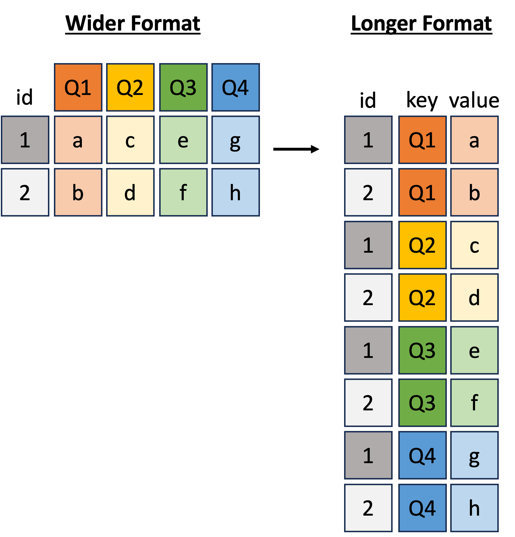
For our example, let us create a long format version of our summary dataset, where we have a single Quarter column and a corresponding AvgPoints column with the average points scored for and against each team per season.
cfb_subset_long <- cfb_subset |>
# keep only the listed columns
select(
Season, Team, Q1, Q2, Q3, Q4, OppQ1, OppQ2, OppQ3, OppQ4
) |>
# reshape data from wide to long format
pivot_longer(
cols = -c(Season, Team),
names_to = "metric",
values_to = "Points"
) |>
# rename columns and create indicator column for Team vs Opponent Points
mutate(
Quarter = case_when(
metric %in% c("Q1", "OppQ1") ~ "Q1",
metric %in% c("Q2", "OppQ2") ~ "Q2",
metric %in% c("Q3", "OppQ3") ~ "Q3",
metric %in% c("Q4", "OppQ4") ~ "Q4",
TRUE ~ "Game"
),
Who = ifelse(str_detect(metric, "Opp"), "Opponent", "Team")
) |>
# keep only 2024-2025 seasons data for simplicity
filter(Season %in% c(2024, 2025))
cfb_subset_long#> # A tibble: 408 × 6
#> Season Team metric Points Quarter Who
#> <int> <chr> <chr> <int> <chr> <chr>
#> 1 2024 Notre Dame Q1 7 Q1 Team
#> 2 2024 Notre Dame Q2 0 Q2 Team
#> 3 2024 Notre Dame Q3 7 Q3 Team
#> 4 2024 Notre Dame Q4 0 Q4 Team
#> 5 2024 Notre Dame OppQ1 10 Q1 Opponent
#> 6 2024 Notre Dame OppQ2 3 Q2 Opponent
#> 7 2024 Notre Dame OppQ3 0 Q3 Opponent
#> 8 2024 Notre Dame OppQ4 3 Q4 Opponent
#> 9 2024 Arkansas Q1 3 Q1 Team
#> 10 2024 Arkansas Q2 17 Q2 Team
#> # ℹ 398 more rowsUsing this longer-formatted dataset, let’s examine the points scored for and against each team per quarter.
facet_wrap()ggplot(cfb_subset_long) +
aes(x = Who, y = Points) +
geom_boxplot() +
facet_wrap(~ Team + Quarter)
ggplot(cfb_subset_long) +
aes(x = Who, y = Points) +
geom_boxplot() +
facet_wrap(~ Quarter + Team)
facet_grid(y ~ x)ggplot(cfb_subset_long) +
aes(x = Who, y = Points) +
geom_boxplot() +
facet_grid(Quarter ~ Team)
ggplot(cfb_subset_long) +
aes(x = Who, y = Points) +
geom_boxplot() +
facet_grid(Team ~ Quarter)
Q: Before running the code chunk below, what do you think the following code would produce?
ggplot(cfb_subset_long) +
aes(x = Who, y = Points) +
geom_boxplot() +
facet_grid(Quarter ~ Team + Season)
Patchwork: Combining Multiple ggplotspatchwork is an R package that makes it easy to combine multiple ggplots into a single layout.
Given any collection of ggplots, we can use patchwork’s wrap_plots() to combine them into a single visualization.
# generate example plots
points_plt <- ggplot(cfb_summary) +
aes(x = Season, y = AvgPoints, color = Team) +
geom_line() +
labs(title = "Average Points per Season")
win_plt <- ggplot(cfb_summary) +
aes(x = Season, y = WinPercent, fill = Team) +
facet_grid(Team ~ .) +
geom_bar(stat = "identity", position = "dodge") +
labs(title = "Winning Percentage per Season")
wrap_plots(points_plt, win_plt, nrow = 1, guides = "collect")
In the above example, we created two ggplots (points_plt and win_plt) and combined them side-by-side using patchwork::wrap_plots(). Note that setting guides = "collect" combines the legends from both plots into a single legend.
Conveniently, wrap_plots() also accepts a list of plots as input. For example,
plt_ls <- list()
for (var in c("AvgQ1", "AvgQ2", "AvgQ3", "AvgQ4")) {
plt_ls[[var]] <- ggplot(cfb_summary) +
aes(x = Season, y = .data[[var]], color = Team) +
geom_line() +
labs(title = paste("Average Points in", var, "per Season"))
}
wrap_plots(plt_ls, ncol = 2, guides = "collect")
patchwork also makes it easy to adjust the theme and other aspects of each plot in the combined layout using &. For example, the code below will set apply the specified theme and color scale to all plots in the patchwork layout.
wrap_plots(plt_ls, ncol = 2, guides = "collect") &
scale_color_manual(
values = c("Notre Dame" = "#0C2340", "Arkansas" = "#9D2235")
) &
theme_classic()
Plotly: Interactive ggplotsFinally, plotly is a package (in R and Python) that allows you to create interactive visualizations. We won’t cover it in detail here, except to mention that plotly has a convenient function ggplotly() that can convert any ggplot into an interactive plotly visualization with just one line of code.
plt <- ggplot(cfb_summary) +
aes(x = Season, y = WinPercent, color = Team) +
geom_point(size = 3) +
geom_line(linewidth = 1) +
scale_color_manual(
values = c("Notre Dame" = "#0C2340", "Arkansas" = "#9D2235")
)
ggplotly(plt)This enables interactive features such as hovering, zooming, and panning. Try clicking and dragging on the plot above! Also, try clicking on the legend labels to toggle the visibility of each team’s data.
plotly also makes it easy to add additional information to the hover text using the aes(label = ...) option. For example, we can add the average points scored per season to the hover text as follows:
plt <- ggplot(cfb_summary) +
aes(x = Season, y = WinPercent, color = Team, label = AvgPoints) +
geom_point(size = 3) +
geom_line(linewidth = 1) +
scale_color_manual(
values = c("Notre Dame" = "#0C2340", "Arkansas" = "#9D2235")
)
ggplotly(plt)